
初步介绍
当然,我知道现在有成千上万个关于 用CSS处理圆角 的教程,但不管怎么说,我仍然想把这篇文章展示给您。也希望您会发现这篇文章会非常有用。需要重点指出的是,这篇教程彻底地应用高级CSS技术,但是,我会尽力使初学者看起来简单。CSS3 在这里还没有得到完全的应用,所以,知道现在,我会保持W3C验证的有效。
我们将怎样来处理?
我处理圆角的版本是由内置的绝对定位的四个div组成,每个div都有唯一的圆角图片作CSS Sprite操作。我们将会这样做:
是什么方式导致这项技术表现得这么了不起呢(What makes this technique cool)?
通过可变的宽度和高度处理毗邻的元素的能力。没有极限。(The ability to make rounded-bordered elements with fluid width and height. No limits whatsoever.) 这项技术,正如我之前提到的,是与 CSS Sprites 结合操作完成的。如果您不知道这是项怎样的技术或者说不知道怎么使用它,那么请先阅读我 之前的文章。CSS sprites 都学会了吗? 那我们就开始吧!
第一步: 创建我们的 Sprite
1、为矩形圆角图片处理选择一款编辑器 (在这个案例中我选择的是Firework).
2、切割并且导出圆角到本地临时位置 (我们将会在之后用到).
3、新创建一个文件,将圆角导入到这个新文件中,复制三次,然后旋转这三个新切片得到另外的三个圆角。

4、合成四个圆角为一张图片, 并用 1px 的红线 来区分它们.

5、导出合成图片,sprite 也就大功告成了。
第二步: HTML 代码
首先,我们会给容器 div 一个 .roundedBox
类 :
<div class="roundedBox"></div>
现在,我们必须再增加四个 div ,这会在将来创建圆角的时候用到。之后必须给每个加载一个类 .corner,同时也标识一个类来指定它们格子的位置。
<div class="roundedBox">
<strong>My content in roundedBox Type 1</strong>
<div class="corner topLeft"></div>
<div class="corner topRight"></div>
<div class="corner bottomLeft"></div>
<div class="corner bottomRight"></div>
</div>
一切搞定? 嗯,让我们把注意力再转移到 CSS 代码上来。
第三步: CSS 代码
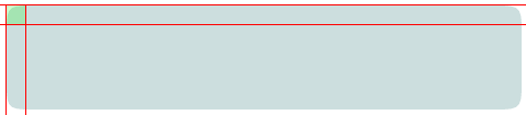
如你所知, (或者您会在这里快速学习到) 绝对定位元素通常都依照相对定位的父元素进行定位。. If this element is not defined, they will take as their parent relatively-positioned element, the body tag.如果这个父元素无法界定,那么它会去最近作相对定位的那个父元素,直至 body 标签。 哈?! - 好了,如果到此为止您仍没有掌握,不用担心,我们将在第二部分了解它。(翻译得有点拗,附上原文:Ok, if you didn’t get this, don’t worry, you’ll catch it in an second.)
让我们先来定义下所有的圆角:
所有的圆角都必须定义绝对定位,并且注明高度跟宽度。 我的圆角定义的宽度跟高度都是 17px. 
.corner {
position:absolute;
width:17px;
height:17px;
}
如果您是第一次切割矩形圆角,那么宽度跟高度很可能会不一样 (咄!)。
现在开始定义 div 容器样式:
.roundedBox {position:relative;}
任何定义有类 .roundedBox 的元素内,绝对定位元素都会相对于这个元素进行定位,而不是标签 body。 我们也必须设置一些padding值,如果没有设置,圆角将会覆盖我们的文本,这肯定不是我们想要的效果。 重要提示: top 和 bottom padding 值必须 等价于圆角的 height。left 和 right padding 值必须等价于圆角的宽度。 正如您已经知道的,我的圆角宽度跟高度是相等的,因此,四个边角的padding 值也是相等的:
.roundedBox {position:relative; padding:17px; margin:10px 0;}
我也通过 margin 给我们的 div 流出了一定的空隙
最后,让我们对没有圆角作单独定义
我们会对每个圆角作绝对定位设置,并且定位背景图的位置 (根据我们的 sprite):
.roundedBox {position:relative; padding:17px; margin:10px 0;}
.corner {position:absolute; width:17px; height:17px;}
.topLeft {top:0; left:0; background-position:-1px -1px;}
.topRight {top:0; right:0; background-position:-19px -1px;}
.bottomLeft {bottom:0; left:0; background-position:-1px -19px;}
.bottomRight {bottom:0; right:0; background-position:-19px -19px;}
您可能已经注意到,我们的样式仍然还没有下载 sprite。我们一般不会去定义它们的原因是,我们会使用另外的方法。
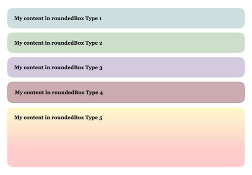
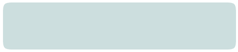
圆形盒模型 1 (蓝色)
HTML 代码:
<div class="roundedBox" id="type1">
<strong>My content in roundedBox Type 1</strong>
<div class="corner topLeft"></div>
<div class="corner topRight"></div>
<div class="corner bottomLeft"></div>
<div class="corner bottomRight"></div>
</div>
我们必须给容器 div 定义一个ID为 #type1,用来实施特殊背景。
CSS 代码:
首先,我们得给 #type1 匹配一个背景色,使之融合于 sprite 中的圆角:
#type1 {background-color:#CCDEDE;}
 之后,通过定义 .corner 类来协助圆形盒模型载入 Sprite 样式:
#type1 {background-color:#CCDEDE;}
#type1 .corner {background-image:url(../images/corners-type1.gif);}
 好了,我们的第一个圆角矩形大功告成了!预览圆角矩形模型1 (蓝色)
圆形盒模型 2 (绿色) / 圆形盒模型 3 (紫色)
模型1,模型2跟模型3的唯一差别就是它们的颜色,所以我们也仅仅只修改这些。
模型 2 (绿色)
HTML 代码:
<div class="roundedBox" id="type2">
<strong>My content in roundedBox Type 2</strong>
<div class="corner topLeft"></div>
<div class="corner topRight"></div>
<div class="corner bottomLeft"></div>
<div class="corner bottomRight"></div>
</div>
CSS 代码 (仅仅修改 sprites 的颜色及背景色) 
#type2 {background-color:#CDDFCA;}
#type2 .corner {background-image:url(../images/corners-type2.gif);}
预览圆角矩形模型2 (绿色)
模型 3 (紫色)
HTML 代码:
<div class="roundedBox" id="type3">
<strong>My content in roundedBox Type 3</strong>
<div class="corner topLeft"></div>
<div class="corner topRight"></div>
<div class="corner bottomLeft"></div>
<div class="corner bottomRight"></div>
</div>
CSS 代码 (仅仅修改 sprites 的颜色及背景色) 
#type3 {background-color:#D3CADF;}
#type3 .corner {background-image:url(../images/corners-type3.gif);}
预览圆角矩形模型 3 (紫色). 都学会了吗?好,现在我们再进一步学习。模型 4 (红色边框)
模型4 跟模型1、2、3又有什么区别呢?边框和颜色,让我们来解决这些因素吧。
HTML 代码:
<div class="roundedBox" id="type4">
<strong>My content in roundedBox Type 4</strong>
<div class="corner topLeft"></div>
<div class="corner topRight"></div>
<div class="corner bottomLeft"></div>
<div class="corner bottomRight"></div>
</div>
CSS 代码 (在 sprite 中给您的边角的边框都添上边框,并使 .roundedBox 类的背景及边框融合 sprite。)

#type4 {background-color:#CCACAE; border:1px solid #AD9396;}
#type4 .corner {background-image:url(../images/corners-type4.gif);}
 好了,这个就是截图效果。我们的边角还不能正确地覆盖 #type4 边框。所以我们必须矫正它们的定位来覆盖早期的定位样式。让我们做到这一点:
#type4 {background-color:#CCACAE; border:1px solid #AD9396;}
#type4 .corner {background-image:url(../images/corners-type4.gif);}
#type4 .topLeft {top:-1px;left:-1px;}
#type4 .topRight {top:-1px; right:-1px;}
#type4 .bottomLeft {bottom:-1px; left:-1px;}
#type4 .bottomRight {bottom:-1px; right:-1px;}
好了,这就是我们完成的模型 4。预览圆角矩形模型4 (红色边框). We are almost there, don’t quit now :p模型
5 (垂直渐变)
好了,模型5会需要更多的工作量,我们应该这样:
让我们开始吧。
HTML 代码 (跟之前的一样):
<div class="roundedBox" id="type5">
<strong>My content in roundedBox Type 5</strong>
<div class="corner topLeft"></div>
<div class="corner topRight"></div>
<div class="corner bottomLeft"></div>
<div class="corner bottomRight"></div>
</div>
CSS 代码:
我的渐变是从上到下垂直的。所以我们必须增加上边角的高度,以及更改下边角的背景图位置。当您看到我的新的 sprite 就会明白为什么会这么处理。就是下面这张: 
我的div中的背景图片是这样的:
 1px 的宽度,它的确是存在的。 我的下边角有一条实心颜色,刚好可以匹配div的背景色。 少说话多行动。我们来继续定义容器 div :
#type5 {background:#FECBCA url(../images/roundedbox-type5-bg.png) repeat-x 0 0; min-height:110px;}
给容器设置的背景颜色是我从底部边角中吸取的。然后将背景图片按 x 方向进行重复。最后我给它设置一个最小高度,正如我之前所说的,渐变才不会泄露。最后来加上所有的边角 (我将文件的类型修改为 .png 格式的图片,为的是能得到更好的渐变质量):
#type5 {background:#FECBCA url(../images/roundedbox-type5-bg.png) repeat-x 0 0; min-height:110px;}
#type5 .corner {background-image:url(../images/corners-type5.png);}
现在,我增加上边角的高度 (这是由渐变最后抵达的颜色位置决定的):
#type5 {background:#FECBCA url(../images/roundedbox-type5-bg.png) repeat-x 0 0; min-height:110px;}
#type5 .corner {background-image:url(../images/corners-type5.png);}
#type5 .topLeft,
#type5 .topRight {height:140px;}
最后,我纠正下下边角的背景图定位:
#type5 {background:#FECBCA url(../images/roundedbox-type5-bg.png) repeat-x 0 0; min-height:110px;}
#type5 .corner {background-image:url(../images/corners-type5.png);}
#type5 .topLeft,
#type5 .topRight {height:140px;}
#type5 .bottomLeft {background-position:-1px -142px;}
#type5 .bottomRight {background-position:-19px -142px;}
全部完成! - 预览圆角矩形模型 5 (垂直渐变)
IE6 版本
这项技术在这一令人讨厌的浏览器中是有问题的。我们必须给容器 (.roundedBox, or #type1, #type2, 等等) 确定宽度跟高度。如果您没有定义它,那么它会泄露到盒模型之外。 使用 IE6 条件式注释法来定义它。
最后的想法
我希望这项技术对您会有帮组,并且不会显得太难。垂直渐变、透明的角落,只要多加练习,您的脑袋会变得更加好用,也会更加容易定义样式。
| Word教程网 | Excel教程网 | Dreamweaver教程网 | Fireworks教程网 | PPT教程网 | FLASH教程网 | PS教程网 |
| HTML教程网 | DIV CSS教程网 | FLASH AS教程网 | ACCESS教程网 | SQL SERVER教程网 | C语言教程网 | JAVASCRIPT教程网 |
| ASP教程网 | ASP.NET教程网 | CorelDraw教程网 |
 QQ:2693987339(点击联系)购买教程光盘


 :
: